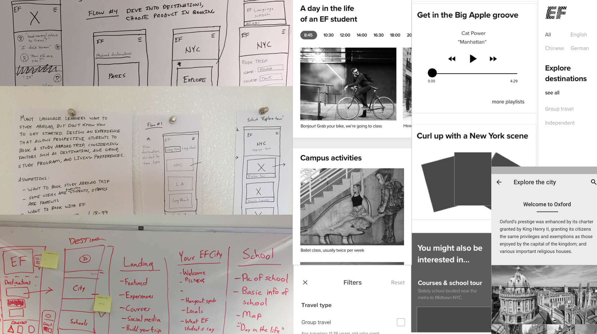
EF Finland
2017 - 2018
I led research on a product team responsible for transforming the digital future of EF Languages Abroad through research-driven design solutions.

Roles: Lead UX Researcher / Designer

Research and design an end-to-end journey where students discover great content that makes them excited and informed enough to book a language course abroad online.

ef finland wireframes

My sketches and wireframes from the early concepting phase

Design research

After senior leadership gave us the brief, I had to understand if their assumption - that people would book an expensive language course directly online - was valid. I flew to Helsinki and did a deep dive with customers and the sales team, learning about students and parents and the sales process, students' motivations to learn a language abroad, and how technology could help them make the decision to book easier.

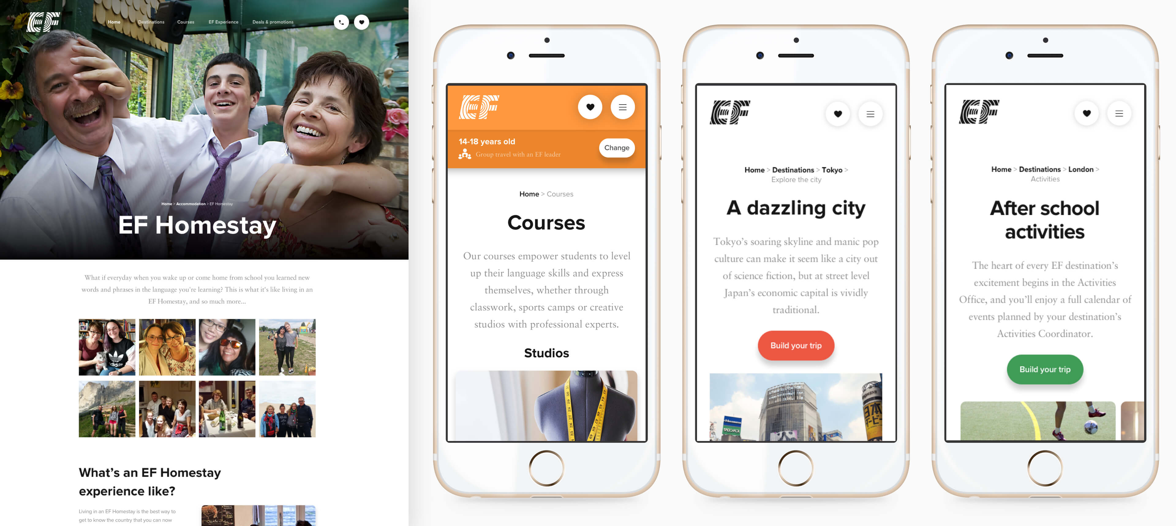
From this research, I sketched user flows and created wireframe prototypes and then tested them in the Helsinki sales office to better understand how users would be more likely to book directly online.

Design process

Research was ongoing throughout the design process. Here are some of the decisions we made:

1. Combining products, age group selection

The first biggest obstacle we encountered was that we had two different products with separate websites: independent travel and group travel. Within these products existed five different age groups. The company asked us to simplify the products digitally by combining them within one user flow.

After testing and iterations, we decided to put the age group selection after the homepage but just before destinations are presented within the flow, so that the destinations shown are specifically for them, with content that is tailored for that age group.

1. All users, all ages, tap 'Explore destinations'

2. A first time visitor is given the option of selecting an age group within the context of travel type

3. A user can now see destinations for their age group while still being able to change the age at any time in their journey

2. Booking flows

Another challenge were the booking flows, which I couldn't change completely because they had to rely on an existing API from the global company (over 53 countries). But in research, I set aside our technical constraints and asked simply: when the user is ready to book, what do they want to do first?

This question and further research led me through several booking flow iterations, three of which I prototyped and tested with users:

Concept 1: Choosing course dates via a calendar, then selecting a course
Concept 2: Choosing a course, then selecting dates via a calendar
Concept 3: Choosing dates with buttons instead of calendar, then making a course selection
Winning design:

User testing showed that users preferred to see the most accurate total price upfront, therefore to show this price the booking flow begins with the option to first select a course

A button date selection (from concept 3, above) tested best

After a month is tapped, the user can select a start date

User research testing indicates that the UI should visually highlight the most popular number of weeks by students

Tapping on a week number shows price as well as allows user to select that number of week

Users can browse different weeks, comparing prices

Users wanted to be able to quickly glance at what the different course types, accommodation options, and insurance options were. Therefore, I added an info icon to relevant content

Users can reserve a course and cancel within two weeks - rather than booking and being locked into an expensive trip

Originally we put insurance add-ons before the trip summary, but analytics showed this slowed users down

I elimated high school name and home address fields, working with the sales managers to minimize the number of required fields so the user can more easily go through the flow

Recognizing that the trip is quite expensive, we offer a low-threshold of €150 downpayment and flexible payment options

In the future, we will add share options on the last step

3. Destination page filters

I learned from the sales team that many customers have difficulty choosing the right destinaton. To help users make the right choice, I worked with customers and the sales team to understand how we can help customers with this decision making process. After interviews, I came up with filter selections to help users narrow their top picks, depending on destination type (beach, city, or college town), activities (swimming, volleyball, dance), and more...

A simple prototype I created for user testing. Framer and HTML/CSS/JS are my go-to tools for prototyping

Impact

We have shifted the company paradigm of what makes an online experience successful: instead of asking potential customers for contact information through primary CTAs, the internal conversation has shifted to creating a content-rich website that promotes booking directly online. In addition, one year after launch, customers are booking twice as much online as they did in the previous year.

ef finland mocks